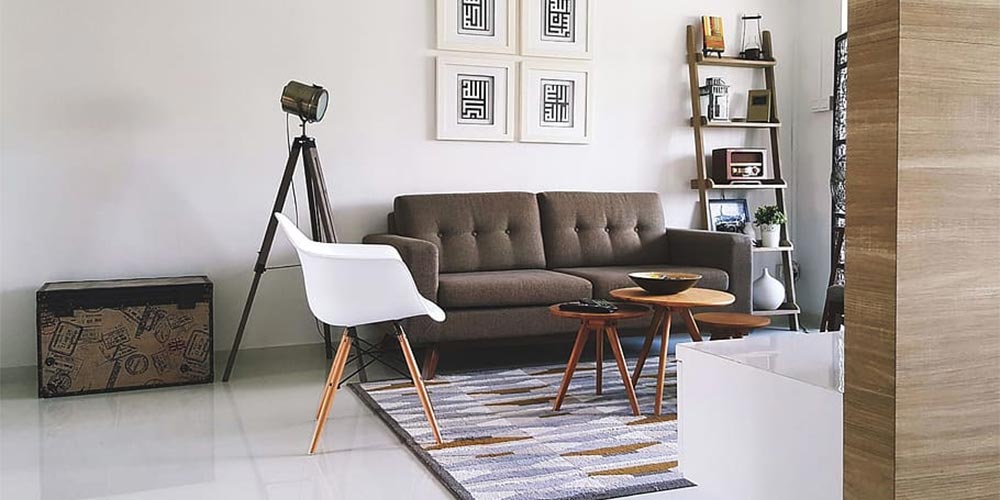
Minimalism is one of the biggest trends in interior design today, and we’re not expecting it to go away any time soon. With that, you are probably one of the many people that want to incorporate this style into your home. But before you start chucking all of your clutter out or painting your walls eggshell white, here are some minimalist interior design mistakes that you should know how to avoid:
1. Not understanding scale
There’s an amazing wall of greenery in your office building designed by landscaping companies in the likes of Vertical Green, and suddenly, you want to have that same kind of wall in your home. With the right type of planning, youcanachieve the same type of ‘green aesthetic’ in your own space, but if your house is small, building a wall of green inside your home may defeat the purpose of minimalism.
The key is to get the scale right, and this applies to many other elements of interior design, such as furniture, decor, and hardware. If you are designing a small-ish living room and want a wall of greenery, for example, maybe stick to indoor plants instead. The same goes for furniture. If you put a large sofa in a small room, the space will look crowded instead of successfully minimalist.
2. Compromising function and comfort
One of the key principles in minimalist interior design is to keep furniture to a minimum. However, keep in mind that the room still has to be functional and comfortable; otherwise, you’re never going to want to use it. So if you are eyeing a sofa that fits the minimalist aesthetic but isn’t really comfortable or big enough, you are likely setting up a room that you’ll hate.
A good tip is to look for furniture that is comfortable, functional, and minimalist all at the same time. Of course, you may need to spend extra time searching the Internet or browsing furniture stores, but the end result will be worth the additional effort.
3. Not having enough decor
Minimalism is all about keeping decor to a minimum, but this doesn’t mean your space should be bare. Otherwise, you can end up with a room that looks cold, uninviting, and barren of all life.
The best way to avoid this mistake is by finding the right balance when it comes to decor. Choose decor that add significant value to the room, and be picky since you can only add a certain amount before the room becomes cluttered. Urban art is a kind of artwork which adds value without overriding the room. Similar to choosing furniture, finding the right decor (and incorporating the right amount into a room) can take some additional time.
4. Having everything in white
When you browse minimalist homes on the Internet or in magazines, white is a central color for walls, decor, furniture, and other elements of interior design. However, not everything in your home has to be white unless you want it to be. While white is a good base for a minimalist home, a room will look lifeless if it doesn’t have any other color besides that. And let’s face it, a room that is too white looks sterile, much like a hospital ward.
Using white as a base is a good idea when designing a minimalist space. But other than that, you should incorporate secondary neutral colors as well as accent colors to bring life to the room. Examples of good natural colors are gray, beige, or light green. Accent colors can be any other color that you want, but they should complement the rest of the elements in the room.
5. Following others’ interpretation of minimalism
Your home is yours, and you shouldn’t let other people’s definition of minimalism put you in a box. While there are countless sources of minimalist home inspirations to look at, you should ultimately hold your own needs and preferences as first priority.
If you don’t like all of your walls to be white, don’t paint them all white. If you don’t want to strip your home to the ‘bare essentials’, feel free to keep whatever you think you need. If you hate indoor plants, look for other kinds of decor. Everyone’s interpretation of minimalism is different, and no matter how many minimalist magazines you read or videos you watch, it all boils down toyourinterpretation.
Designing a minimalist home seems like an easy endeavor. After all, you’re just taking out a lot of stuff from it, right? Not at all. Minimalism in interior design is more difficult than it seems, and you definitely don’t want these mistakes to hinder you from achieving your dream home.
