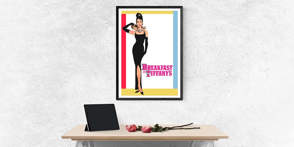
Posters have long been the primary source of advertising for films, and the success of the new release would rest on their shoulders. Because of this, the artistry put into posters had to be unique, eye-catching, and aesthetically pleasing.
Some posters have become iconic and have gone down in history, fetched thousands at auctions, found themselves at the centre of a mystery, or become pop-culture symbols in their own right. Let’s take a look at some great movie posters of the past and consider what made them so successful.
Jaws
Arguably the most iconic poster of all time, the classic image of the great white shark baring its sharp teeth is enough to end a shiver down anyone’s spine. The famous artwork was used both for Steven Spielberg’s 1975 blockbuster and the Peter Benchley book that the film was based on. The artist, Roger Kastel, first envisioned this design after flicking through the first few passages of the novel. As soon as the idea came to him, he needed to make it a reality. He started by photographing stuffed sharks at the American Museum of Natural History and then hiring 24-year-old model Allison Maher to play the part of the innocent swimmer, just inches away from the shark’s looming bite. The painting was created using oil on Masonite.
What makes this poster so good?
The simplicity of this poster is one of its finest features. The red lettering is striking against the white background — signalling the danger and excitement that the movie promises. It illustrates the thrilling theme of the film without overcomplicating things, creating an iconic design that has been reimagined over the years. To add even more interest to the poster’s back story, the whereabouts of the original Jaws painting remains a mystery to this day.
Pulp Fiction
The poster for Quentin Tarantino’s 1994 cult classic Pulp Fiction has been an undeniable student flat staple ever since the film’s release. Any student wanting to prove their extensive pop-culture knowledge and love of retro cinema will choose this iconic print to plaster up in their bedroom — this is part of the film’s legacy.
What makes this poster so good?
Similar to the Jaws poster, this image is punchy and bright. The contrasting yellow and red is guaranteed to draw eyes. Cleverly, the poster reimagines a classic pulp magazine design rather than representing a particular part of the film itself. Pulp magazines, which were published between 1896 and the 1950s, were inexpensive publications that were a little rough around the edges. The Pulp Fiction poster emulates the pulp design perfectly, while also focussing on Uma Thurman’s character, Mia Wallace, who became a pop-icon after the film’s release.
Breakfast at Tiffany’s
Another student house classic, the poster for the 1961 film Breakfast at Tiffany’s has certainly withstood the test of time. Audrey Hepburn’s sophisticated character, Holly Golightly, fronts this iconic print. Her simple black dress and elongated cigarette holder elude to glamourous times-gone-by, making the print appealing to anyone with a sense of nostalgia.
What makes this poster so good?
Although the poster’s design is minimalist, it still perfectly expresses an era of cocktail parties and consumerist extravagance. It is the fact that this poster evokes and entire time period which transcends the film itself, that has allowed the design to go down in history. The simple and elegant design works as a standalone piece of art as well as a movie poster, which is perhaps why it has become one of the most sought-after film posters of all time.
Little Miss Sunshine
Now for something slightly more contemporary — you certainly can’t miss this bright, attention-grabbing print. Little Miss Sunshine is a dark comedy which touches on some serious issues in unusual and heart-warming ways. The rusty old VW campervan is the most iconic element of this film, and it is the vehicle’s bright yellow colour that creates the simple yet effective marketing theme. The dysfunctional family who are “on the verge of a breakdown” run alongside the van on the poster, depicting one of the most memorable moments in the movie.
What makes this poster so good?
The designer behind this poster decided that in place of a logo or a memorable strapline, a bold colour would become the distinguishing element of this film’s marketing efforts. The bright sunshine yellow of the entire poster is what makes it unique. Similar to the previous posters we have discussed, the design is simple, and there is no mistaking it. With the details of the background removed, the focus is entirely on the family. Fittingly, this is what the film seeks to do — represent one family on a journey.
Metropolis
Even if you’ve never seen this 1927 German science fiction film, you will probably recognise the poster. An artwork in itself, the poster evokes the 1920s’ Art Deco style in a beautiful display of futurism. As well as being undisputedly iconic, this has become one of the most valuable movie posters of all time. In 2012, one of the four surviving original posters was sold along with a bundle of rare film posters for a totally of $1.2 Million.
What makes this poster so good?
In addition to its rarity and value, this poster is a beautiful art piece. You don’t even need to have seen this dystopian film to appreciate the artistry that its creator, Heinz Schulz-Neudamm, put into his masterpiece. Unusual for its time, satisfyingly symmetrical, and distinctly haunting, this poster has gone down in history, arguably surpassing the fame of the film itself.
Article provided by Where The Trade Buys, UK business card printers with locations in London, Sunderland and Surrey.
Sources
https://nypost.com/2015/07/26/how-the-famous-poster-from-jaws-was-created-and-lost/
https://www.complex.com/pop-culture/the-most-iconic-movie-posters-of-all-time/pulp-fiction
https://mashable.com/2015/06/25/pulp-fiction-books/?europe=true
https://www.theguardian.com/film/2008/oct/13/breakfast-at-tiffanys-poster-service
https://www.empireonline.com/movies/features/best-posters/
https://www.hollywoodreporter.com/heat-vision/metropolis-poster-leads-12-million-402242
https://www.theguardian.com/film/2012/jun/26/movie-poster-auction-fritz-lang-metropolis
